Simple Chart: John Murphy
Technical and especially Chart analysis has become more popular than ever today. One reason for this is the existence of complicated, yet inexpensive software called CHARTS.
Traders today have easier access to computers than they did decades ago. Another reason for the popularity of charts is the Internet.
Anyone can go online today and find an amazing set of visual information of the market. Most of this information is available for free or at a very low cost.

See all Intermediate Forex Training Sessions
Another revolutionary development for traders is the availability of live market data. With the rapid growth and expansion of the market in recent years and the popularity of short-term trading, easy access to live market data has become an essential tool or weapon available to the arsenal of traders and technical analysts.
Traders goes from rags to riches and some do the opposite daily by minute-to-minute price data. Not to mention that the ability to track and profit from those short-term market movements is one of the strong points of chart analysis.
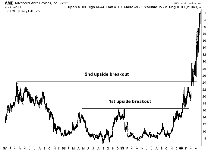
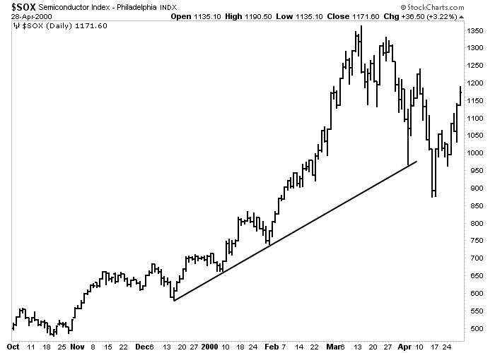
In the second half of 1999, technology was in a good position, and this was reflected with the significant gains in the Nasdaq. Stocks of biotechnology and advanced technology were prominent market leaders. If you were in those kinds of stock, you would do a great job for your entire life. If you were and invest somewhere else, you would have been probably a loser.
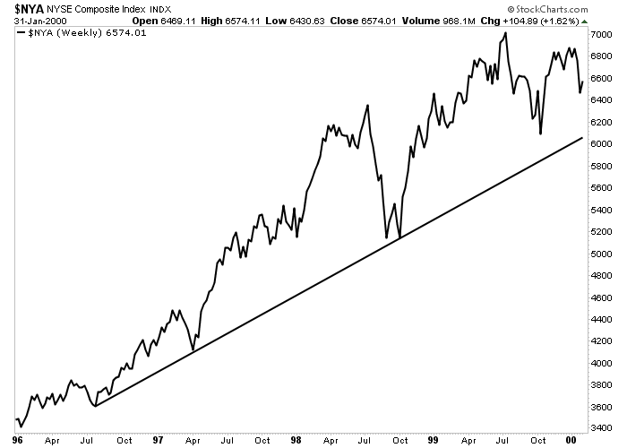
In the spring of 2000, a sharp sell-off in biotechnology and technology sector Nasdaq stocks led to a steep correction, causing a sudden turnaround in previously ignored market industries such as drugs, assets and basic industry stocks – as money from the “New Economy” stocks, flowed to the shares of the “old economy”.
While the underlying reasons for the sudden change in trend were not clear at the time, traders who had access to live market data – could easily see everything in charts – and knew how to interpret it correctly.
This latter point is especially important because access to charts and data is only useful if the trader knows what to do with them. We will teach you these important aspects of chart analysis.
charts can be used by themselves or in combination with fundamental analysis. Charts can be used to determine enter and exit points or to study basic strategies. Charts can also be used as a warning tool to warn the trader that something is changing in the fundamental of the market.
Whichever of the methods you choose to use them, charts can be a valuable tool – if you know how to use charts. This tutorial is a good start on learning how to work.
Topics of the Article
Add a header to begin generating the table of contents
Why is Chart Analysis So Important?
Successful presence in financial markets requires mastering in chart analysis. Consider the fact that all decisions in different markets, are based on predicting the market. Whether the market participant is a short-term trader or a long-term investor, predicting the price is usually the first and most important step in the decision-making process.
To accomplish this task, there are two forecasting methods available for the market analyst: Fundamental and Technical.
Fundamental analysis is based on the traditional study of supply and demand factors that makes the price increase or decrease.
In financial markets, fundamental analysts look at items such as corporate earnings, trade deficits and changes in money supply.
The purpose of this method is to achieve an estimate of the intrinsic value of a market to determine whether a market is increasing or declining.
In contrast, technical analysis or chart analysis, is based on the study of market performance.
While fundamental analysis examines the reasons or causes behind the rise or the fall of the price, technical analysis studies the effect of price movements.
This is where studying price charts comes into play. Chart analysis is very useful in the price prediction process. Charting can be analyzed solely on its own without using any basic input or we can use it containing basic data. However, price prediction is only the first step in the process of decision-making.
Market Timing: John Murphy’s Viewpoint
From John Murphy’s point of view on the Simple Chart, the second and often more difficult stage is the Market Timing.
For short-term traders, minor price movements can have a significant impact on trading performance.
Therefore, the exact time for enter and exit is an essential aspect of any trade in the market. Frankly speaking, Timing is everything in the stock market or the forex market.
For reasons that we will soon make apparent to you, Timing is entirely technical in nature. In this case, it can be seen that the use of chart principles becomes absolutely necessary at a stage of the decision-making.
What is Chart Analysis?
John Murphy believes that chart analysis (also called technical analysis) is the study of market performance, using price charts, to predict future price direction.
The idea of technical theory is the belief that all factors affecting market prices – basic information, political events, natural disasters and psychological factors – are quickly reflected in market activity.
In other words, the effect of these external factors is quickly reflected in a kind of price movement, up or down (rise or fall). Chart analysis, therefore, is simply a short-term form of fundamental analysis.
Consider the following: Price increases reflect bullish principles, where demand exceeds supply.
Falling prices mean that supply exceeds demand and describe a downward trend.
These changes in the basic equation cause price changes which can easily be seen in the price chart.
chart analysts with the help of Simple Charts, can quickly take advantage of these price changes without necessarily knowing the specific reasons behind them.
The analyst simply argues that rising prices indicate a fundamental uptrend and that falling prices reflect declining trend.
Another advantage of chart analysis is that market price is usually the main indicator and benchmark. Thus, chart action can alert a fundamental analyst that something important is happening below what is seen at surface.
Charts Show the Price Trend
Markets are moving in trends. The main value of price charts is that they show the existence of a market trend and by this they greatly facilitate the study of that trend.
Most of the techniques used by technical analysts is used to identify important trends and help to determine the potential amount of those trends and identify changes in their direction of the trends as soon as possible.
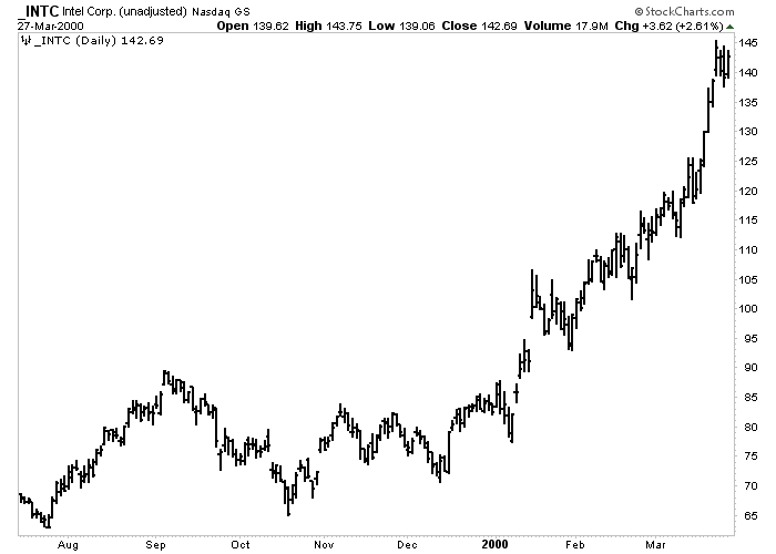
Daily Bar Chart
This daily chart INTEL is a good example of an uptrend over a six-month period. Charts make it easy to study the trends. Important trends continue after consolidation.
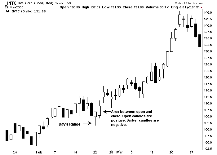
Candlestick Chart
candlestick chart of INTEL stock which includes two months. The narrow wick is the range of the day. The fatter part is the area between opening and closing price. bright candles are bullish; Darker ones are bearish.
Different Types of Charts in Forex Market
The most popular type of chart used by technical analysts is the daily bar chart. Each bar represents a trading day.
Japanese candlestick charts have become popular in recent years. Candlestick charts are used in the same way as bar charts, but they provide a more graphical representation of the trades.
Line charts can also be used. The bar chart simply connects the closing prices of each consecutive day and is the simplest form of chart.
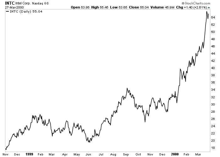
Linear graph
Below is the line chart of INTEL for a full year. A line connecting successive closing prices is the simplest form of the chart.
Past Charts Can Illuminate the Future
According to John Murphy, all of the above charts can be used at any time. The daily chart, which is the most popular time period, is used to look at price trends over the past year. Weekly and monthly charts can be used to analyze a longer range trend dating back to five or ten years ago.
For short-term goals (or day trading), intraday charts are mostly used. [Intra-day charts can be plotted for short timeframes as 1M, 5M or 15M.]
It is true that charts show the past, but from historical data we are able to predict the future of the market based on current trends or market support and resistance.
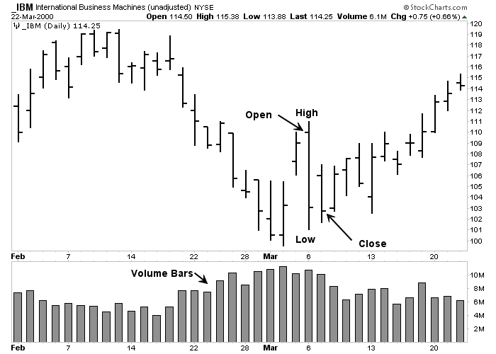
The structure of the daily bar chart is simple. The vertical bar is drawn from the highest day to downwards. The left tick is open. The right tick is close. Volume bars are plotted at the bottom of the chart.
Market trends and continuation of trends are two basic introductions to Chart Analysis. Trend analysis is the same as Chart Analysis.
Charts and trends are characterized by a series of highs and lows. The uptrend is a set of highs and peaks of uptrends.
The downtrend shows of lows. In the end, trends are usually classified into three main categories: Major, Secondary, and Minor.
The major trend takes more than a year. A Secondary trend, from one to three months; And a Minor process, usually two weeks or less.
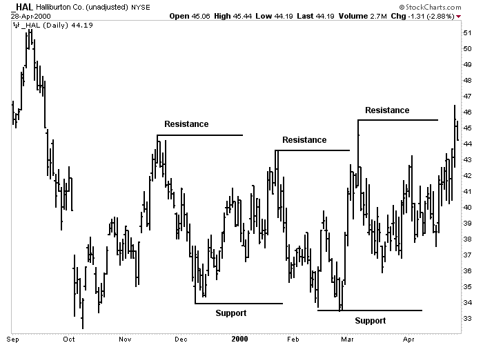
Channels and Levels of Support and Resistance
There are two terms that describe the tops and bottoms of the chart. The previous swing channel usually forms the support level.
Support is below the current market price where the buying pressure is greater than the selling pressure and the decline stops in that zone.
Resistance is marked by the previous high of the market.
The resistance is at a higher level than the current market price where the selling pressure is more than the buying pressure and the rally or uptrend stops.
In Forex, the two most commonly used terms are support and resistance.
Support and Resistance
The uptrend is characterized by an increase in tops and bottoms. Any peak or high is called Resistance. Each of these lows is called Support. The uptrend continues as it passes through the resistance.
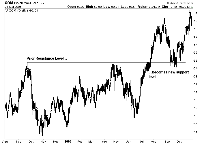
Changing the Support and Resistance Levels into One Another
Support and Resistance levels reverse the roles after being broken. In other words, the broken level of support in the market becomes a level of resistance in the market.
The broken resistance level acts as a support level. The more recent is formed the level of support or resistance, the more power it has on the market’s next moves.
This is because many of the trades that played a role in shaping that level of support and resistance have not been settled and are likely to influence subsequent trading decisions.
Reversing the Roles, the Support and Resistance
An example of role reversal. The broken resistance level usually becomes a new support level. In the downtrend, the broken level of support turns into a resistance.
Credible Trend line in John Murphy’s Simple Chart
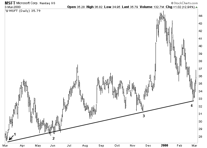
According to John Murphy, trend line chart analysis is perhaps the simplest and most valuable tool available to the technical analyst.
An uptrend line is a straight line drawn to the right that connects the bottoms (support points) in rising markets.
The line is drawn in such a way that all price actions are above the trend line.
A Downtrend line is drawn to the right and connects the consecutive tops in downtrends. The line is drawn in such a way that all price actions are below the trend line.
For example, an uptrend line is drawn with at least visible two increasing bottoms (or depressions).
However, if two lines are required to draw a trend line, a third connection point is required to identify the line as a valid trend line.
If prices in an uptrend test the downtrend line for the third time and bounce from it, a valid uptrend is confirmed.
Valid Trend Line
An example of an uptrend. Upward trend lines are drawn below the market trend line. As shown here, a valid trend line must be touched three times.
The Benefits of Drawing Trend lines and Price Channels in Technical Analysis
Trend lines have two main uses. They allow to find new trading opportunities by the levels of support and resistance that can be used while the market is growing.
As a rule, the more effective the trend line and the more times it is tested, the more important and credible it becomes.
Breaking the trend line is often the best warning for trend change.
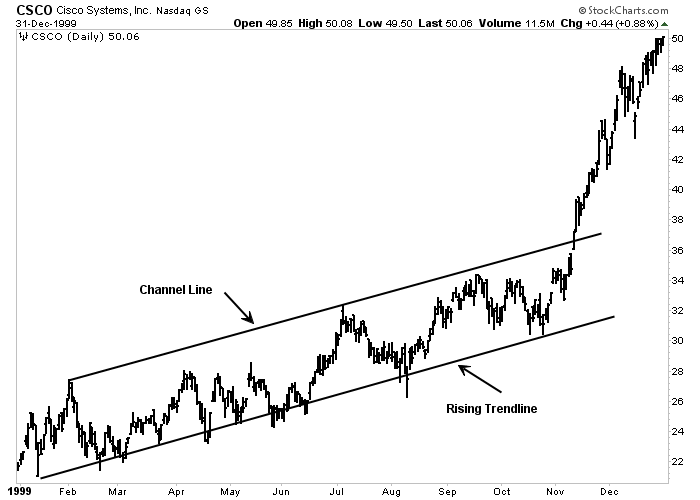
Channel lines are straight lines that are drawn parallel to the main trend line. A rising channel line is drawn above the price and parallel to the main trend (which is below the price).
A falling channel line is drawn below the price and parallel to the downtrend (which is above the price).
Markets often follow these channels. In this case, the people who work with John Murphy’s simple diagram can use this knowledge to their full advantage by knowing earlier what support and resistance is likely to be.
Price Channel
Example of channel line. During the uptrend, prices often face new SELL positions along the upper channel line that runs parallel to the uptrend.
John Murphy’s Reversal and Continuing Price Patterns
According to John Murphy, in a simple chart, one of the most useful features of chart analysis is the price patterns that can be classified into different categories and is worth to be predicted.
These patterns reveal the consistent conflict between supply and demand, as reflected in the interaction between levels of support and resistance, and allow the chart reader to assess which side is winning the conflict.
Price patterns are divided into two groups – the reversal pattern and the continuing pattern.
Reversal patterns usually indicate that a trend in the opposite direction is taking place.
Continuing patterns usually show temporary pauses in the current trend.
The formation of continuing patterns takes less time than the reversal patterns and usually leads to the resumption of the main trend.
Reversal Patterns in John Murphy’s Simple Chart
In the following, we will introduce you the reversal patterns introduced by John Murphy.
You may think this post is a bit long, but to fully understand what John Murphy said, we need to put all of these topics together in one post.
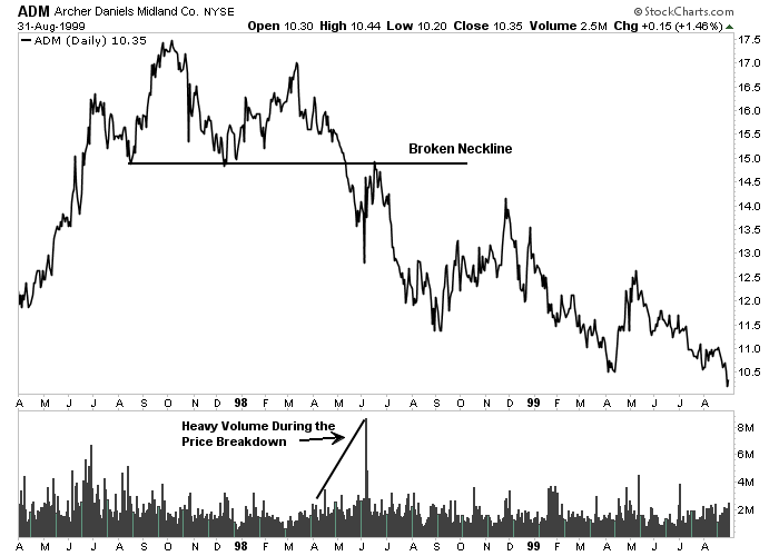
Head and Shoulders Pattern
Head and shoulders are the most known and probably most probable reversal patterns.
A downward head and shoulders are marked by three prominent market peaks. The middle peak or the head is higher than the two side peaks (shoulders).
An upward head and shoulders are marked by three prominent market peaks. The middle peak or the head is lower than the two side peaks (shoulders).
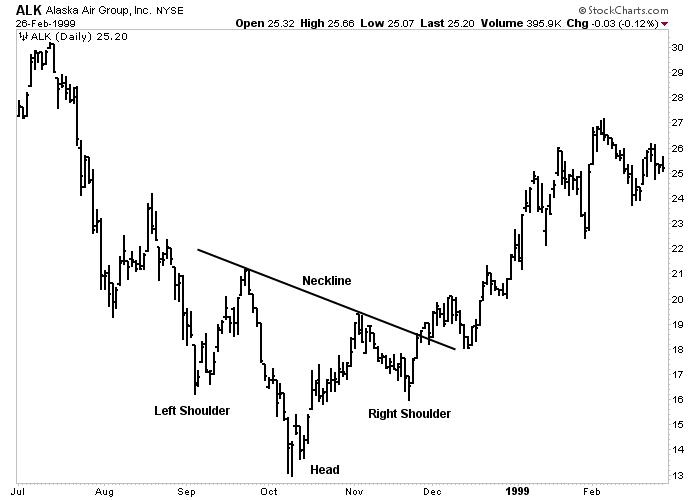
A trend line (neck line) is drawn under the two bottoms. A section near to below the neckline creates this perfect pattern and represents an important reverse point in the market.
The price target can be determined by measuring structure of price patterns.
The measurement method in a pattern is to measure the vertical distance from the head to the neckline and so the target would be the same distance downwards beginning from the point of breaking the neckline.
Double Tops & Triple Tops and Double Bottoms & Triple Bottoms
Another reversal pattern is the triple top or triple bottom. The only difference of this and head and shoulders pattern is that the three tops or the three bottoms in this pattern occur in almost the same size or the same level.
The triple tops or triple bottoms and the pattern of the head and shoulders are interpreted in the same way and have essentially the same meaning.
Double top or double bottom pattern (also called M and W due to their shape) have two tops or two bottoms instead of three.
The double top is marked by two prominent tops. The inability of the second top to go higher than the first top is the first sign of weakening the trend.
When prices fall and go below the middle line, the highest price doubles. The measurement method for the double top is also based on the height of the pattern.
The height of the pattern is measured from the point of breakout and is projected downwards. Double bottom is The image double top.
John Murphy’s Continuing Patterns
Discussing of Chart Analysis in John Murphy’s Simple Chart, there been identified a series of continuing patterns, which we are going explain later.
John Murphy’s Triangle Pattern
Instead of warning the market to reverse, continuing patterns are continued in the direction of the main trend. Triangles are one of the most valid continuing patterns.
There are three types of triangles that is worth to be predicted – i.e. symmetrical triangles, ascending triangles and descending triangles.
Although these patterns sometimes show a price reversal, they are usually just some pauses in the dominant trend.
A symmetrical triangle (also called a coil) is characterized by price fluctuations between two converging trend lines.
The top line is decreasing and the bottom line is increasing. Such a pattern describes a situation in which the buying and selling pressure is in balance.
Somewhere between half and three-quarters of the pattern, when forming this pattern, is measured from the left side of the pattern to the point where the two lines meet at the right (peak). The pattern must be created with a breakout. In other words, prices close beyond one of two trends in a convergent trend.
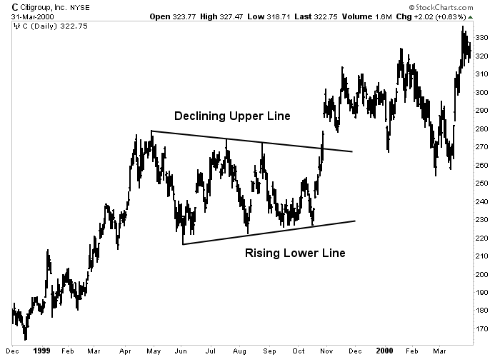
The ascending triangle pattern has a smooth upper line and a rising lower line. This is usually a bullish pattern since buyers outnumber sellers.
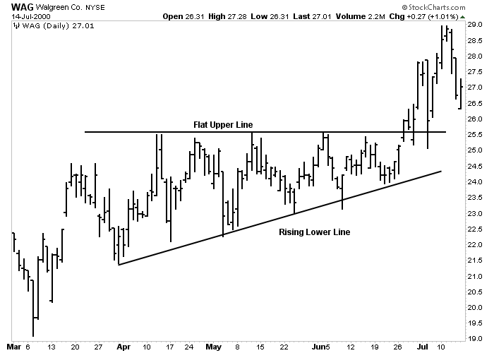
The descending triangle has a descending upper line and a flat lower line. This is usually a falling pattern as sellers are outnumbered the buyers.
The measurement method is the same for all three triangles. Measure the height of the triangle at the widest point to the left of the pattern and then consider that vertical distance from the point where both lines are broken is the target.
While ascending and descending triangles have an internal bias, symmetrical triangles are naturally neutral.
Since it is usually a continuing pattern, the symmetrical triangle is worth predicting and indicates that the previous trend will be resumed.
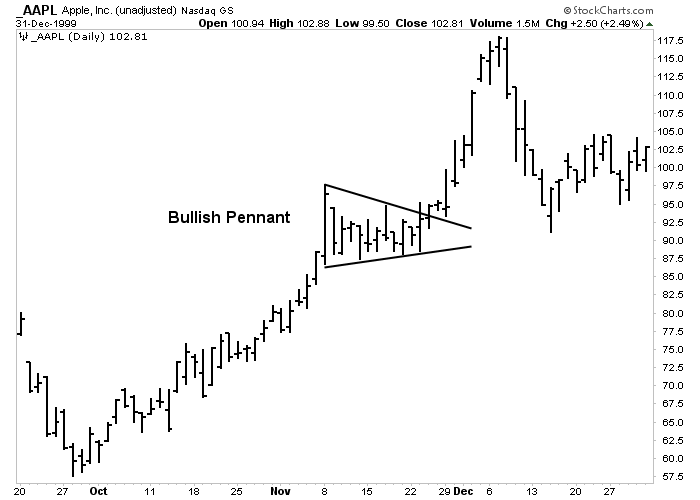
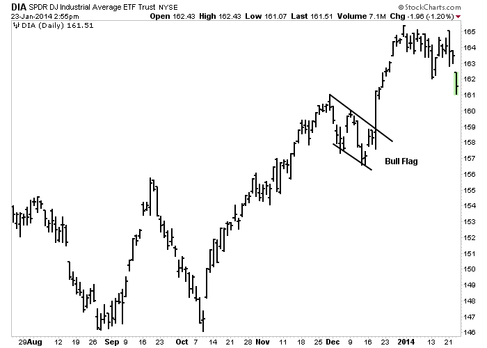
John Murphy’s Flag Pattern
These two patterns continue the short-term trend, showing short pauses or breaks during the dynamic market trend.
Both already have a steep price movement (called the pole).
In an uptrend, the steep advance pauses to rest and moves sideways for two or three weeks. Then the uptrend continues.
The names correctly describe their formation. The pennant is usually horizontal with two converging trend lines (like a small symmetrical triangle). The flag looks like a parallelogram that is a little inclined in the opposite direction of the overall trend.
Therefore, in the uptrend, the rising pennant has a downward slope.
In a downtrend, the falling pennant is sloping upwards.
Both patterns are said to “fly halfway”, meaning that they often occur midway through the trend and cause the market to move and fluctuate sideways halfway along the trend.
According to John Murphy in simple chart analysis, in addition to price patterns, there are several other formations that are shown in price charts and provide valuable insights to the person working with the simple chart.
These formations include the price gap, the key reversal days and the percentage retracements.
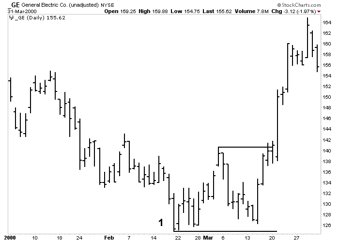
Price Gaps
Gaps are zones in the bar chart where no trades have been made. An upward gap occurs when the lowest price for a day is higher than the highest price of the previous trading day.
A bearish gap means that the highest price for a day is lower than the lowest price of the previous day.
There are different types of gaps that appear at different stages of the trend. The ability to distinguish between them can create useful and profitable insights in the market.
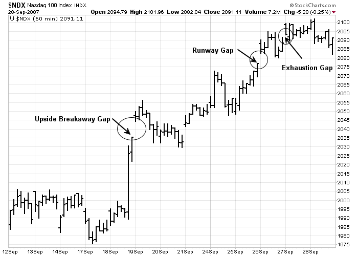
The gap usually occurs after the completion of the important price pattern and indicates a significant movement in the market.
breakouts at the top of the head and shoulders, for example, often occur in breakaway gap.
The runway gap usually goes ahead well along the trend. This gap appears almost halfway through the price action (hence it is also called the measurement gap since it indicates the remaining amount of movement).
During the uptrend, breakaway and runway gaps usually turn into support levels in down markets with subsequent declines.
During the downtrend, these two gaps act as resistance to market surges.
The exhaustion gap occurs right at the end of the market movement and represents the last resting in the trend.
Sometimes the exhaustion gap is followed within a few days by the breakaway gap in the opposite direction, and within several days, price action fills the gaps. This phenomenon is called the island reverse market and is usually a sign of a significant market reversal.
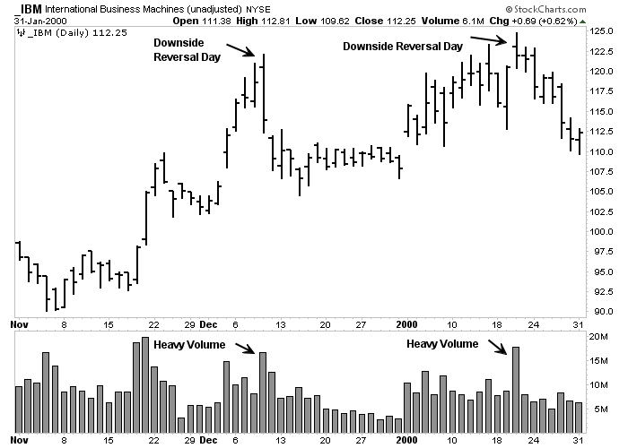
Reversal Key Day
This minor pattern often warns us that the trend may soon be reversed.
In an uptrend, prices usually open higher, then fall sharply and close below the previous day’s closing price.
The larger the range and the heavier the volume, the more considerable would be the alert.
Reversal days outside the range (which high and low of the current day range are both larger than the previous day range) are more powerful.
The reverse key day is a relatively minor pattern that is considered due to its specific qualifications, but can be significant if other technical factors indicate a significant change in the trend.
Percentage Retracement Pattern
Market trends rarely happen in smooth lines.
Most cases of the trends show a set of zigzags that have several corrections to the existing trend.
These corrections are usually placed in certain predictable percentage parameters. The most famous example of this is the 50% correction.
In other words, a secondary or middle correction against a major uptrend often reverses until half of the previous uptrend before the trend resumes.
falling market fluctuations also recover almost half of the previous downtrend.
The minimum correction is usually about one-third of the previous trend. two-thirds is the maximum correction that is allowed if the previous trend resumes.
Correction above the two-thirds point is usually a warning of a changing trend.
Chartists also give much importance to 38% and 62% retracement, which is also called Fibonacci retracement.
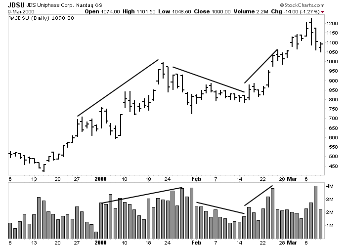
Interpretation of Volume According to John Murphy
Technical analysts use a two-dimensional approach to analyze the market that involves studying price and volume. Of the two, price is more important.
However, the volume provides important secondary confirmation of price action in the chart and often gives previous warnings that the trend may change soon.
Volume is the number of units traded over a period of time, usually one day. Volume can also be checked weekly for analysis of wider ranges.
When used in conjunction with price performance, volume tells us about the strengths or weaknesses of the current price trend.
Volume measures the pressure behind a given price move. As a rule, heavier volume (indicated by the larger vertical bars at the bottom of the chart) should exist in the direction of the dominant price trend.
During the uptrend, more volume should be seen when creating a lower volume range (lower volume bars) when down corrections.
In a downtrend, more volume should occur in sell prices. when jumping, the SELLs should be done with less volume.
Trading Volume is an Important Part of the Price Pattern
According to John Murphy, volume plays an important role in formation and spotting the price pattern. Each of the price patterns described earlier has its own volume pattern.
As a rule, the volume of patterns decreases with formation. The next breakout that eliminates this pattern becomes more important if it is accompanied by a severe breakout.
Heavier volume puts more weight on the price action, with the breakout of the trend line and support or resistance levels.
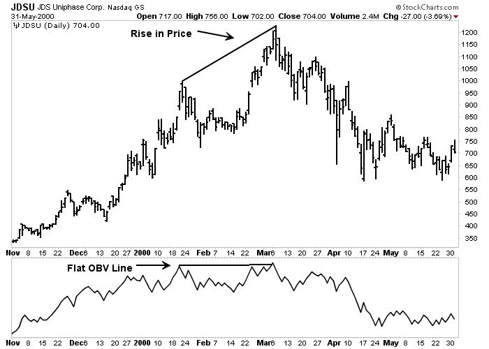
Balance Volume (OBV)
Market analysts have several indicators to measure trading volume. One of the simplest and most effective is Balance Volume (OBV).
OBV plots an inverted volume versus a descending volume. Every day that one more market closes, the volume of that day is added to the previous one.
Every day, the volume decreases from the total. Over time, the balance volume will go up or down.
If there is suddenly an uptrend, it shows the trader that the downtrend volume is increasing, which is a good sign that the downtrend may continue. A fall on the OBV line is usually a sign of decline.
Plotting OBV
The OBV line is usually drawn below the price chart. The idea is to make sure the price line and the OBV line are in the same direction and vertically matched.
If prices are rising, but the OBV line is neutral or falling, it means that there may not be enough volume to support higher prices.
In that case, a divergence between a bullish line and a flat or bearish OBV line is a negative warning.
Spotting Breakout Using OBV
During periods of directional price movement, when the market trend is shocking, the OBV line is sometimes broken first and is a sign of future price direction.
An upward breakout in the OBV line should attract the trader and make him look closely at the market or stocks.
At the bottom of the market, a bullish increase in the balanced volume is sometimes an early warning for an uptrend.

Other Indicators Regarding Volume
There are many indicators that measure the volume trend – with names such as Accumulation Distribution, Chaikin Oscillator, Market Facilitation Index and Cash Flow.
Although they are more complex in their calculations, their goal is the same to determine whether the volume trend confirms or differs from the price trend.
اگرچه آنها در محاسبات خود پیچیده ترند ، اما هدف آنها یکسان است تا تعیین کنند آیا روند حجم روند قیمت را تأیید می کند یا از آن متفاوت است.
How to Use Time Frames to Display the Price Action in the Short and Long Term
Bar Chart Analysis is not limited to daily bar charts.
Weekly and monthly charts provide a valuable and long-term view of market history that cannot be achieved by daily charts alone.
The daily bar chart usually shows up to twelve months of price history for each market.
Weekly charts show approximately five years of data, while monthly charts go back more than 20 years.
By studying these charts, John Murphy’s technical analyst gets a better idea of the long-term trends, where the historical support and resistance levels are located, and can get a clearer picture of the more recent action shown in the daily charts.
These weekly and monthly charts are perfectly suited to the standard chart analysis described previously in this post.
The view of some market activists that chart analysis is only useful for short-term analysis and timing is just incorrect.
The principles of chart analysis can be applied in any time frames.
John Murphy: How to Use Daily Charts
Daily and weekly charts are useful for mid and long term analysis. For short trades, daily charts are very valuable.
Daily charts usually show just a few trading days.
A 15-minute bar chart, for example, may only show you data for three or four days and is worth it.
The 1M or 5M chart usually shows only one or two trading days and is usually used for daily trades.
Fortunately, all of the chart principles described here can also be applied to daily charts.
First Long-Term Chart, then Short-Term
Just as daily bar charts are essential for timing and market analysis, accurate chart analysis should begin with monthly and weekly charts, respectively.
The purpose of this method is to provide the long-term perspective necessary for the analyst as a starting point. As soon as you reach the 20-year monthly chart, you should consult the 5-year weekly chart.
Only then you examine the daily chart.
In other words, it is a good idea to start with a comprehensive overview and then gradually shorten the time frames. (For even more microscopic analysis of the market, the daily chart study can be done by carefully examining the daily charts).
How to Use a Top-Down Market Approach
The idea of starting an analysis with a broader perspective and gradually focusing on the details has another important application of the market analysis.
This is about using a “top-down” approach to market and stock analysis.
This approach uses a three-step approach to finding profitable stocks or charts.
It starts with an overall view of the market to determine if the stock market is moving up or down and if it is a good time to invest in the market.
It then divides the stock market into market sectors and industrial groups to determine which sectors appear stronger.
Finally, it searches for the main stocks or the best currency pair charts in those specified sectors and groups.
Step # 1- Overall Market Average
The purpose of the first step in the top-down approach is to determine the overall market trend. Having a bull market (an uptrend) is a good time to invest in the market.
The existence of a bear market (downtrend) may indicate a more cautious approach in the market.
To measure the market trend, one can look at one of the several main market averages.
This was because most main averages usually move in one direction. However, this has not always been the case lately.
For this reason, it is important to have some familiarity with the main market averages and to know what each one actually measures.
Different averages measure different things.
The Traditional Blue Chips Average (name of an index) – such as the Dow Jones Industrial Average, the NYSE Composite Index and the S&P 500 – generally represent the best benchmark for a major trend.
Conversely, the Nasdaq Composite Index is heavily influenced by technology stocks. While the Nasdaq is a good barometer of trends in technology sector, it is less widely used as a measurement for overall market trends.
The Russell 2000 Index measures the performance of smaller stocks. For this reason, it is mainly used to measure the performance of that part of the market.
Russell is less useful as a benchmark for broader markets made up of larger stocks.
Since most of these markets are usually available in the financial press and the Internet, it is usually best to keep an eye on them all.
The strongest signals about market directions are given when all or most of the main market averages are in one direction.
Step #2: Industrial Sectors
The stock market is divided into market sectors, which are mostly divided into industrial groups.
There are ten market sectors, including raw materials, consumer cycles or cyclical, non-consumer cycles, energy, finance, health, industry, technology, telecommunications and software services.
Each of these sectors can have as many as ten sectors or more industries.
For example, some groups are in the fields of computer technology, Internet, networks, office equipment, and semiconductors.
The financial sector includes bank brokers, insurance and securities.
The suggested way to approach this group is to start with a smaller number of market sectors. Look for the ones that seem the strongest.
For example, for most of 1999 and early 2000, technology stocks represented the strongest market sector. Once you have separated the sector, you can look for the strongest industry groups in that sector.
The two main candidates in the period just described were Internet and semiconductor stocks. The idea is to be in the strongest industry groups in the strongest market sectors.
Step 3: Individual Stocks or Single Charts
For those investors who trade in individual stocks or single charts such as gold or oil, this is the third step in a “top-down” market approach.
After separating an industrial group or a currency that has strong bullish potential, the trader can look for a suitable stock chart or currency pair in that group.
Another advantage of restricting the search for stocks or indices or currency pairs to successful sectors and groups is that the search is significantly limited.
There are about 5,000 stocks that an investor can choose from.
There are so many types of charts that can make you confused.
Market analysis is very difficult in many markets. Some sort of screening process (filtering) is required. This is the same as three-step process.
By limiting the search to a small number of industry groups, the number of items you have to study can be significantly reduced.
You also have the convenience of knowing that every chart you look at is already part of a successful group.
Moving Averages
In the field of technical indicators, the moving average is extremely popular among technical market analysts.
Moving averages make the price action analysis easier and make it easier to identify underlying trends. Accurate trend signals can be obtained from the interaction between a price and an average or between two or more averages.
Since the moving average is made with the average of closing prices of last few days, it tends to lag behind price action.
The lower the average (meaning fewer days are used to calculate it), the more sensitive it is to price action changes and the nearer to the price action it is.
The longer the average (by calculating more days) the longer is the price action and the less responsive it is to trend changes.
The Most Popular Moving Average
In stock market analysis, the most popular moving average lengths are 50 and 200 days. [In weekly charts, those daily values are converted into 10 and 40 weeks.]
During an uptrend, prices should be above the 50-day average. Minor retracements often come back from this average, which acts as a support level.
Closing the candle below the 50-day moving average is usually one of the first signs that stocks or currency pairs are correcting more sharply.
In many cases, breaking the 50-day average indicates a further decline to the 200-day average.
If a market is correcting a bullish market, it should find new support around its 200-day moving average.
(For short-term trading purposes, traders use an average of 20 days to determine short-term trend changes).
Of course, these numbers are for the stock market, and for the Forex market and other different charts, many different numbers are used by technical analysts.
Bollinger Bands Indicator
These are trading bands that are designed to have two standard deviations higher and lower than the 20-day moving average.
When a market touches (or goes beyond) one of the trading bands, the market is considered too wide or broad. Prices often return to the moving average line.
MACD indicator
MACD stands for Moving Average Convergence Divergence.
The MACD indicator is a popular indicator. On your computer screen, you will see two weighted moving average (weighted moving average gives more weight to the recent price action).
Trading signals are given when two lines cross over each other.
RSI Indicator or RSI Oscillator
The RSI indicator is one of the most popular oscillators used by technical analysts.
The RSI is scaled from 0 to 100 with horizontal lines drawn at levels of 70 and 30.
RSI values above 70 are considered overbought. RSI reading below 30 are called oversold zones. The most popular time periods for RSI are 9 and 14 days.
RSI stands for Relative Strength Index.
Stochastics Indicator
This oscillator is also scaled from 0 to 100.
However, the top and bottom lines (marking the level of overbought and oversold) are at levels 80 and 20.
In other words, a price above 80 is called over-bought, while below 20 is called over-sold.
One added feature of Stochastics is that instead of one line, there are two oscillator lines. (Slower line is usually moving average of the faster 3-day line).
Trading signals are given when two lines cross each other. When a faster line crosses over the top of the slower line, a buy signal is given.
When the faster line crosses over the top of the slower line from above 80, a sell signal is given.
The duration most chart analysts use is 14 days.
We have given a full explanation of each of these indicators and oscillators in the Best Forex Indicator section.
John Murphy Simple Chart: Conclusion
In this article, however, we have expressed the different sectors of the market from a chart viewpoint.
This article was a summary of John Murphy’s book “Charting Made Easy” in which John Murphy has tried by expressing the simplest possible ways to teach us in the chart that with even these simple items in the chart, profit can be achieved.
The point to keep in mind is that the more confirmation you receive when entering into a trade, the higher is the credibility of that signal.
We provided an introduction to technical analysis here because it applies to all financial markets.
We have briefly discussed the most important tools used by charts, including: initial chart analysis, study of volume, moving average, oscillators, ratios, weekly and daily charts. The successful trader learns how to handle all of these elements. Combine market analysis into a coherent theory.
Many of the Internet-based software and products available in the market today also offer powerful tools that make plotting the charts and technical analysis much easier – much easier for investors than ever before.
For example, many Internet-based software and products provide you with a complete set of technical analysis tools, which allows you to easily create charts, have instant access to history data, and the ability to create, retest, and optimize your trading systems without requiring any programming knowledge or experience.
Technical analysis provides an excellent vehicle for market forecasting, with or without basic input.
Market timing is purely technical in nature, so successful market participation requires the use of technical analysis.
We hope you find this relatively long post useful and comprehensive.
If you are active in the Forex market
Be sure to charge an account with him
He charged the first exchange of Forex brokers

She charges 5 star Forex exchange
☆☆☆☆☆ 5/5
Who is John Murphy?
John Murphy, StockCharts.com Senior Technical Analyst, is a very popular author, columnist, and speaker on technical analysis.
What is John Murphy’s simple chart like?
In his book “Charting Made Easy”, John Murphy talks about how to make a profit with a simple chart.
The Persian translation and abstract of this book is available for free in this post. You.
What other article should I read by John Murphy?
In my opinion, in addition to this post, be sure to read the article 10 John Murphy’s Law < / p>
Was John Murphy a technical analyst?
John Murphy’s books and articles suggest that John Murphy was a technical style writer and financial market analyst.